LUMNI
Lumni is a digital educational website produced by France's public audiovisual sector, enabling pupils from nursery school to the end of secondary school to consolidate the knowledge they have learned through the school curriculum.
Brief
To redesign the Lumni website by implementing an artistic direction for its interface to improve user involvement. This new design will have to comply with WCAG (Web Content Accessibility Guidelines) accessibility requirements.
My role
Based on the brand strategy determined beforehand, and in collaboration with France.TV's Lead Brand Designer, I redesigned the site using emotional and evolutive mechanisms (a "living" interface that engages with the user with a comforting tone, a design that adapts to the user's school level). The result conveys the brand's commitment: " Lumni accompanies you in understanding and learning about the world ". I then produced a UI kit and wrote the Art Direction and User Interface guidelines for the designer in charge of developing the content pages. Every week, I set up a follow-up meeting with him to make sure that the documentation had been properly understood and that the site's pages were being designed correctly.
Deliveries
Three versions of the hub "school level" page (elementary, middle school and high school) / UI kit / Art Direction guidelines / User Interface guidelines.
Company
France TV
Disciplines
UI Design, Art Direction, Brand Identity
Visit the website
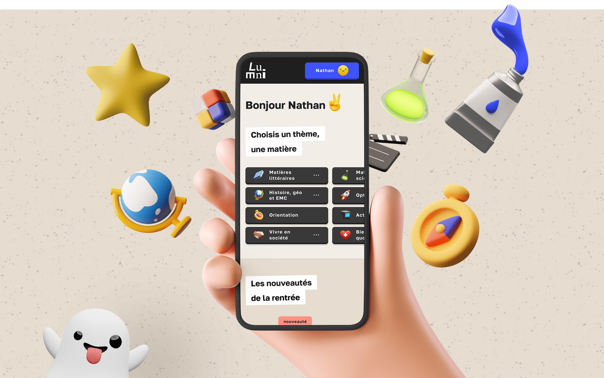

THE RECIPE
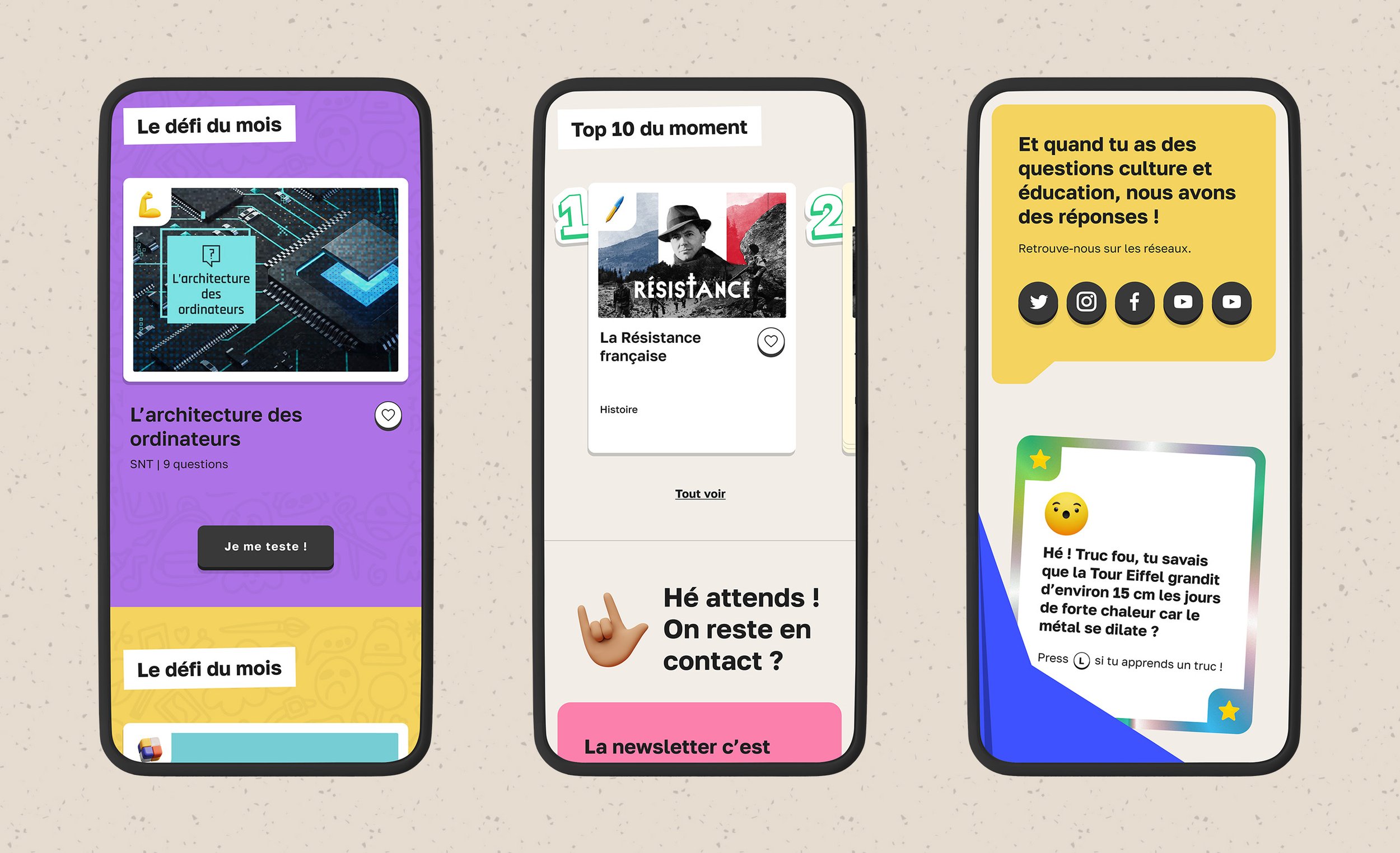
A variable typography - Golos Text - optimised for readability on screens and providing a better responsive experience.

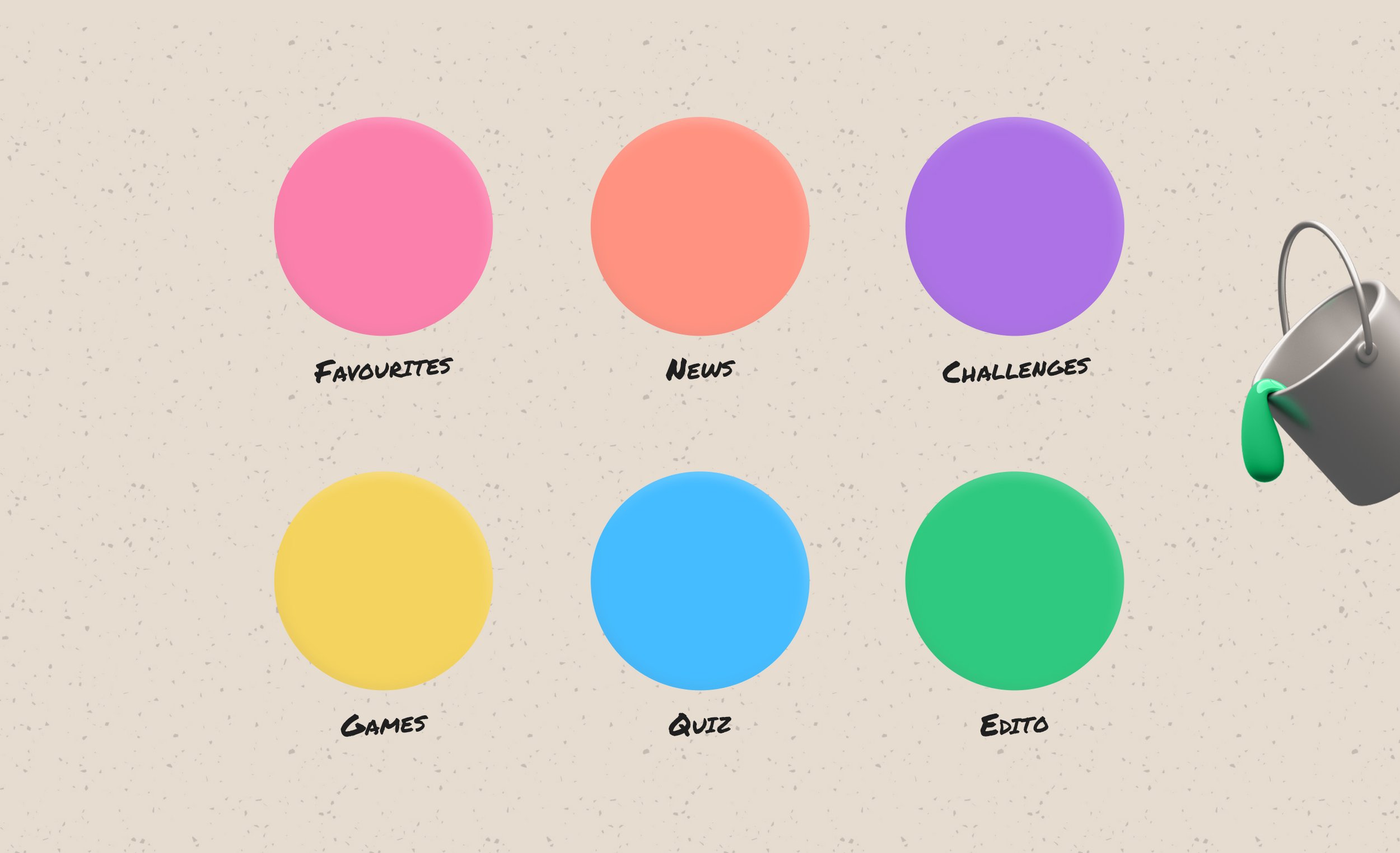
A strong main color for an assertive, recognizable brand without the logo. Beige and anthracite black to reduce the cognitive load. A range of bright, saturated secondary colors to identify the different types of content and speak to the user's emotions.
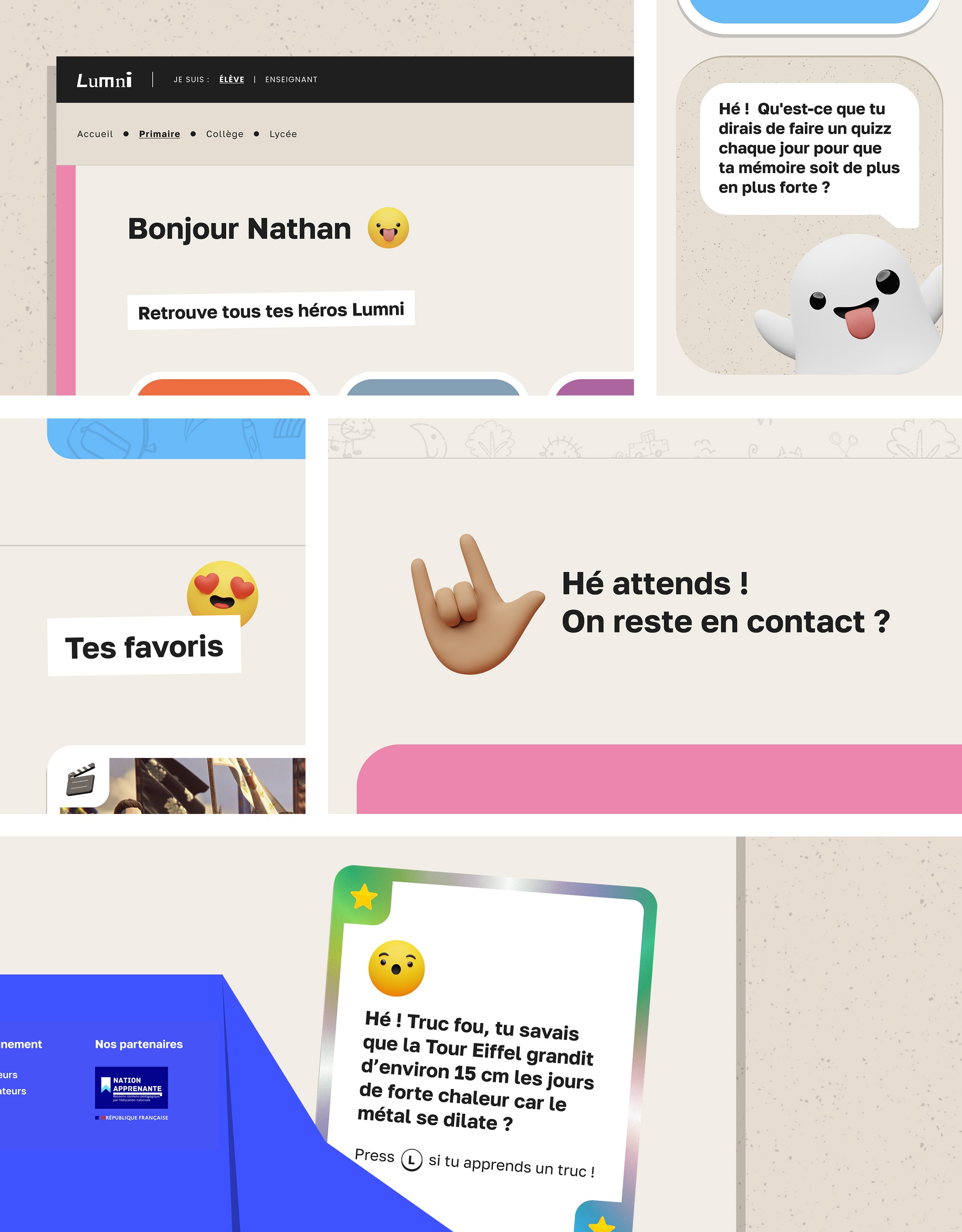
Emojis and 3D gestures with soft, rounded shapes, associated with specific components to create complicity and dialogue with the user.

Calls to action that look like game controller buttons and make you want to click on them.

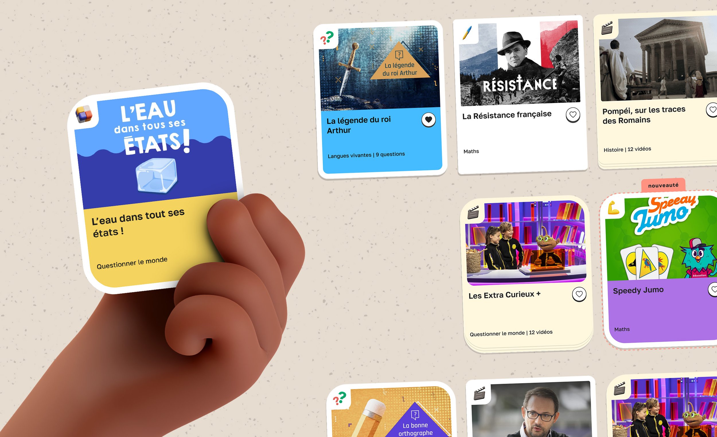
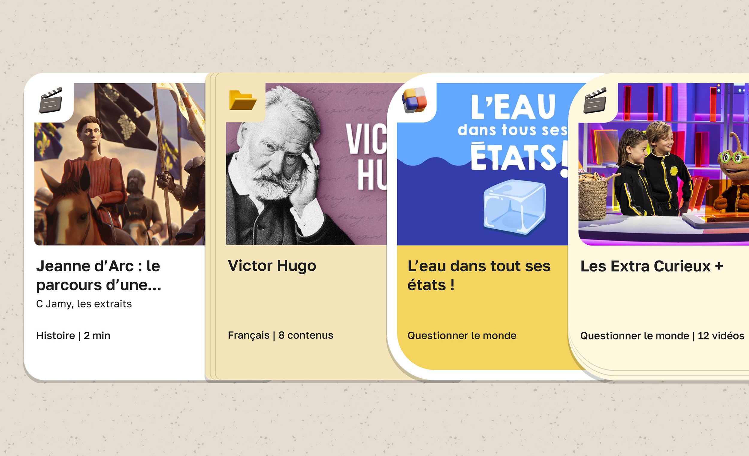
Cards with a "tangible" look that brings to mind board games and makes you want to pick them up.
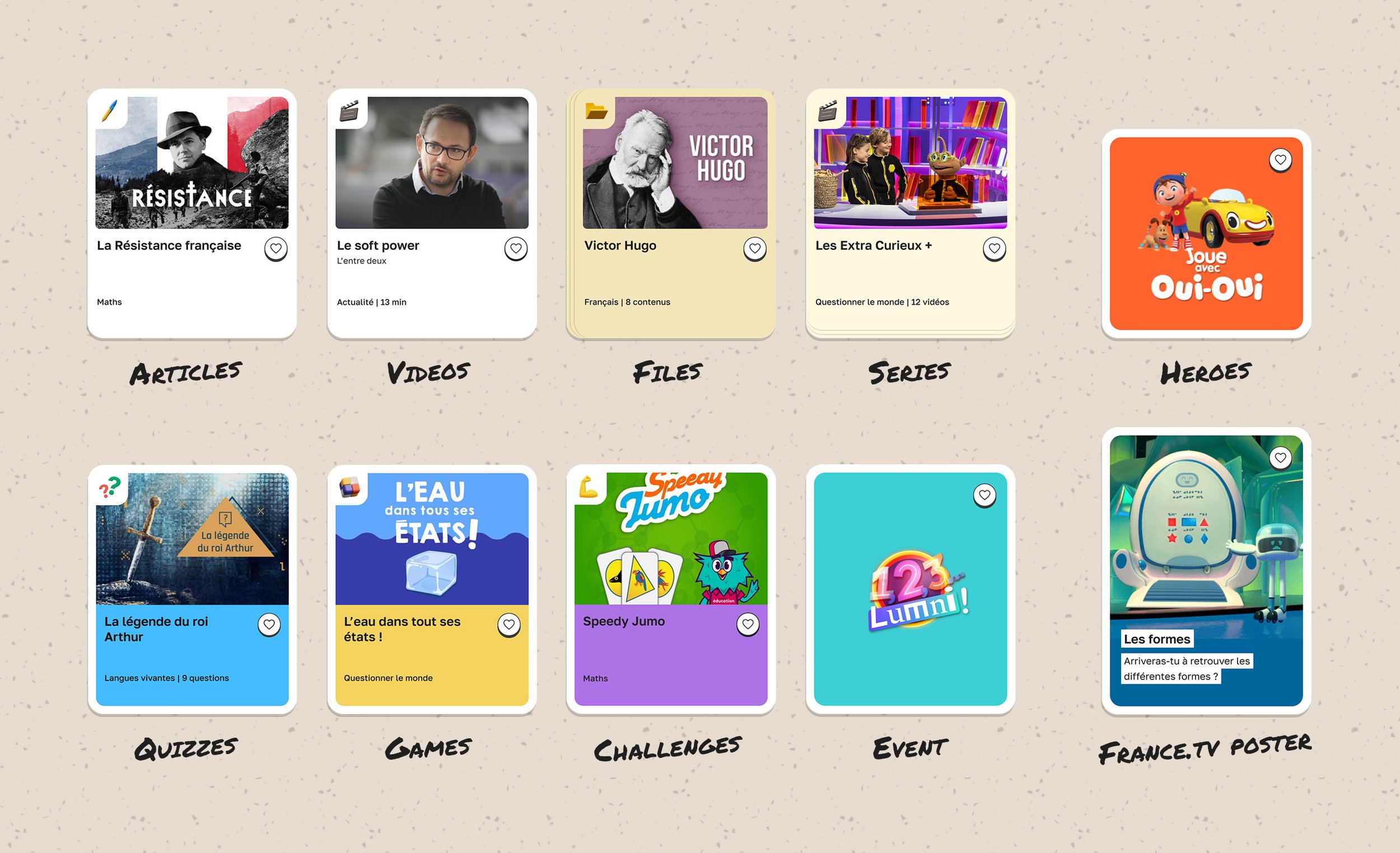
A specific design for each typology of card enhancing the playful touch of the new interface.
A friendly interface that communicates with the user by using a comforting tone of voice to better accompany him learning about the world.
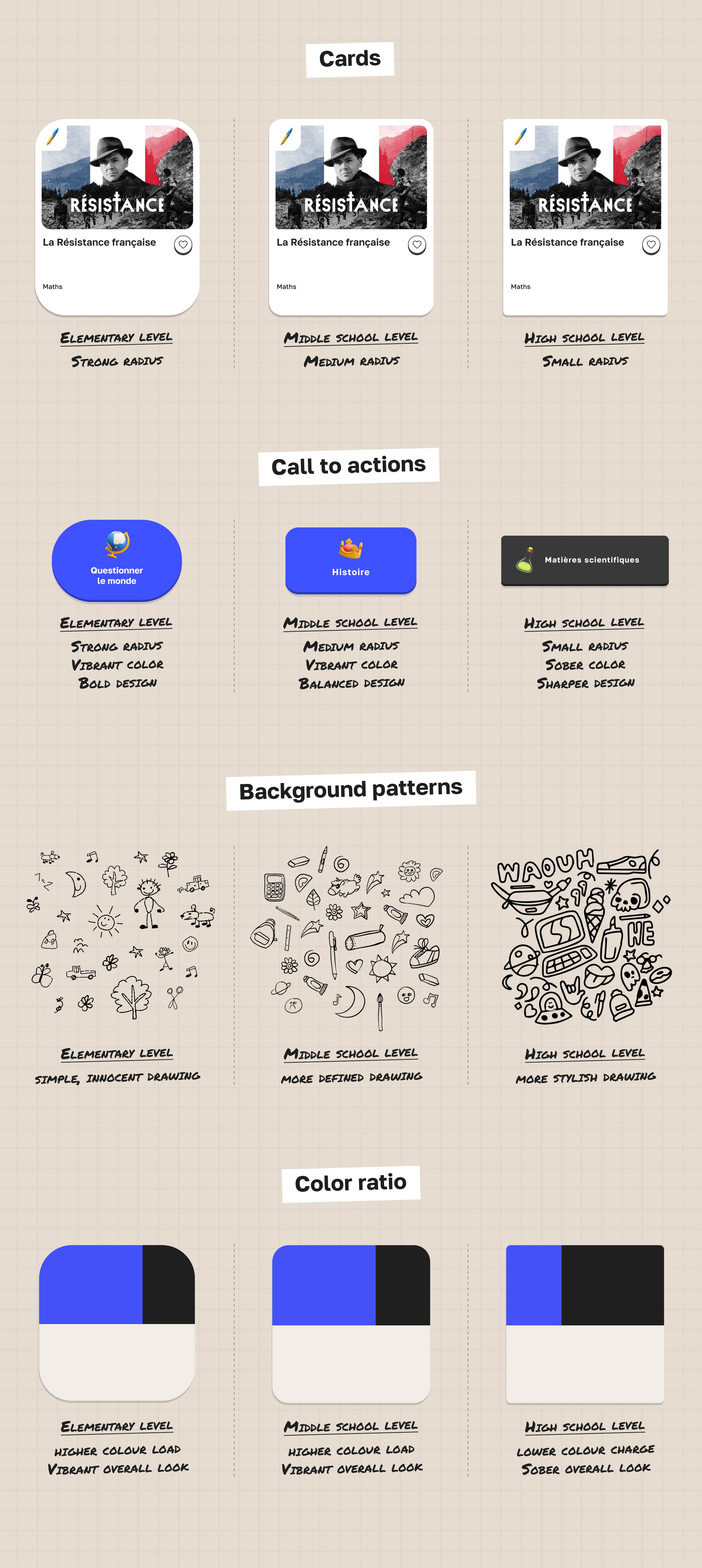
Components with a design that adapts to the school level selected, to match the pupil's point of view.
A pixel-perfect design ensures that card contents are precisely aligned, despite their different typologies, reducing the user’s cognitive load.
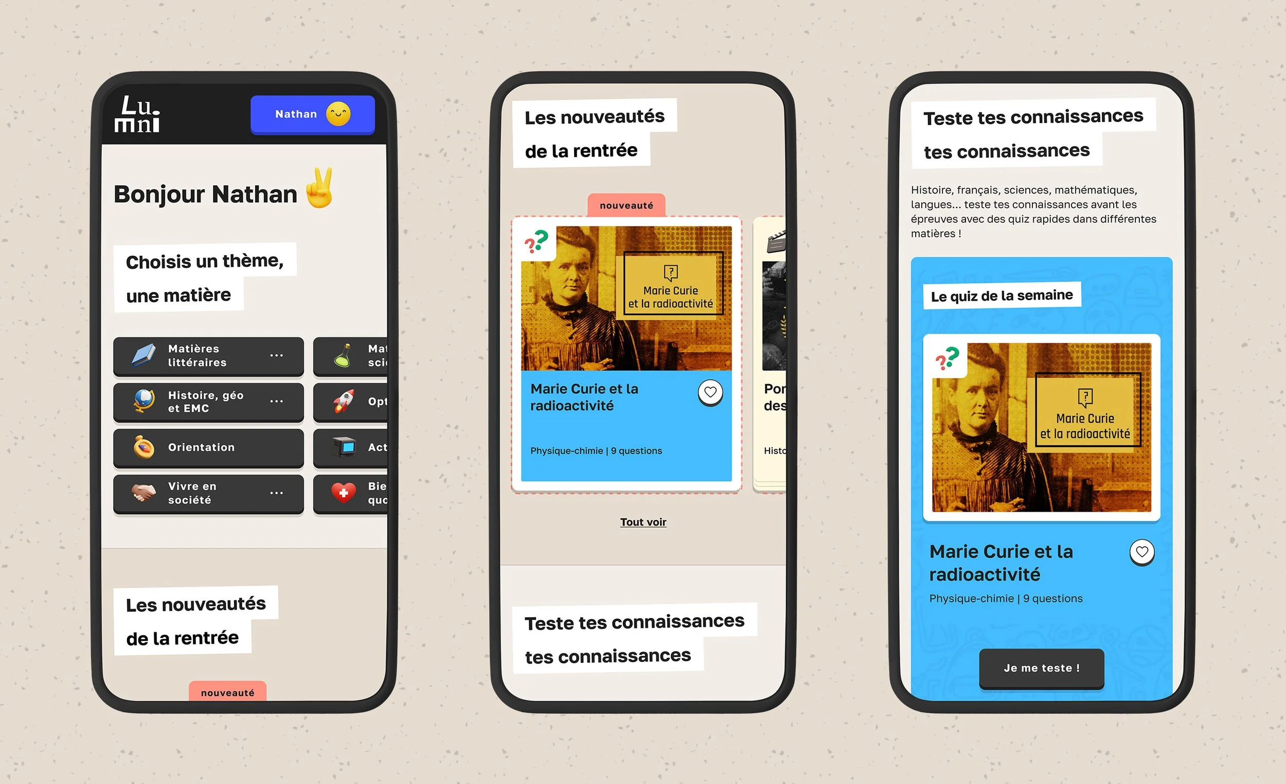
A richly detailed interface design that makes the new Lumni look warm and alive. While ensuring optimal cognitive load and obtaining an accessibility audit score of 92% (vs. 35% for the old design).

Deliveries
High school version of the hub page on mobile.
Elementary version of the hub page on desktop.

Middle school version of the hub page on desktop.

High school version of the hub page on desktop.

Complete guidelines detailing the artistic direction and interface design of the new Lumni for the teams in charge of producing the website's pages.
